Link to the website file: http://www.gamefront.com/files/20975060/web.rar
2011年11月8日星期二
2011年10月23日星期日
Link to final Interactive PDF:
500 words draft
Special lamination was a design prerequisite against the high density of buildings in Manhattan. First, spaces of different proportions were prepared for the programs requested such as the gallery, lobby, office and multipurpose space. Then they were shifted off axis in different directions, conforming to local regulation. Natural lights enter from the slits in the ceiling produced by the shifting of boxes. The glass facade to the lobby connects the museum to its surrounding environment. Decision like this allows the museum’s spaces vary in scale and feel so that exploring the art becomes a journey.
As the inspiration of sample shapes and complexities within deceptively simple appearance from the original New Museum of Contemporary Art by SANAA, the new idea is to redesign the model and transformed into a private house for a family. The open spaces like the glass facade will be kept in the new model which provides a sense of freedom. The simplicity concepts also could be found and this is the characteristic for most of the architectures designed by SANAA. The site for this house would be placed away from the build environment. As it will be a place of peace to allow people enjoy the feel of freedom.
This house is designed for family with child. The concepts of redesigning this building are shapes and privacy. Protecting privacy could be shown from the interior views of the two bedrooms. The two bedrooms are located beside the holes. Although there are some holes on the surface of the building, people from outside cannot see the inside through the holes unless the masters of the house open the curtain. The protective screen on the third floor could also show this concept. Owners of the building are able to shut down or open the screen for privacy or better views. The big balcony surrounded by glass facade on the third level ensures that people could stand there and freely have better sights.
The exterior style of the redesigned house is quite simple like consisting by three different sizes boxes. This particular feature is also recognizable for most of the architectures designed by SANAA. Genially, SANAA’s architecture has many elements that are impossible to be found unless someone enters it. A stacked box design allows for skylights to bring diffused light into the spaces of the museum. The holes on the surface of the front wall could also lead the skylight come into the room without any block. However, the owners could draw the curtains if they do not need that.
2011年10月22日星期六
2011年10月9日星期日
Concept: Shape and Privacy
I think the style of SANAA's architectures is quite simple like consisting by boxes. The shapes SANAA frequently-used are square and rectangular and these shapes can be found generally in the outside of the building. SANAA's architecture embraces complexities within deceptively simple appearances. It has many elements that are impossible to understand unless someone enter them.
2011年9月25日星期日
2011年9月18日星期日
Week 7
PDF 2 Pages:
The PDF file can be found here:
http://www.gamefront.com/files/20790966/new+museum+of+contemporary+art+f.pdf
The PDF file can be found here:
http://www.gamefront.com/files/20790966/new+museum+of+contemporary+art+f.pdf
2011年9月11日星期日
2011年8月21日星期日
frames of animation
interior plan of the building
top perspective
front perspective
bottom perspective
front perspective
left section
Architect Post and my view
In this poster, there are three main parts. The top left corner is the photo of the architect which displays what the poster is related about. The second part is some of the architectures designed by this architect. Each of the different architectures are divided nicely by an office building in Poland which is also designed by this architect. Through the size of these images, its main focus is also on this part which displays the well-known buildings designed by this architect. The third part of this poster is at the bottom of it. It introduces the career of Norman Foster and the producer of this poster. As for the colour of this poster, it is pretty colourful. However, the top and bottom parts are a little bit lighter than the middle part, which is because the producers tried to increase the focus for the middle. The main font that takes all attention is the top left conner that displays the architect name which has the largest font. All of the other fonts are smaller and should be considered the words are less important than the pictures in this poster.
Reflection on this project
For this assignment, we are asked to develop an environment which should be inspired by the architectures designed by a contemporary architect. The paper folding from week 1 were inspired by Norman Foster. I found his architecture works are famous around the world. Two buildings I was interested and they are Swiss Re building and Reichstag dome.
After folding paper, I worked on developing creatures which should also be related to the architectures designed by Norman Foster. The Spore Creature Creator is a impressive program which allows us to design everything we could think of. Therefore, we can not only make creatures with heads or legs, but also some objects like chairs and desks.
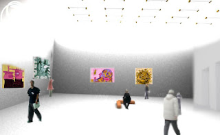
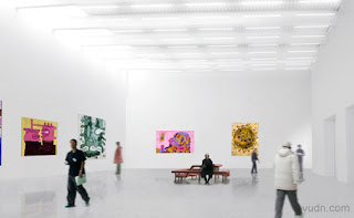
The first environment was inspired by the Reichstag dome and the second environment was inspired by the Swiss Re building. However, I found that the second one would be too simple and less stuff can be done. Therefore, I chose the first one and keep editing it. The outside design was pretty hard for me at the beginning of the development. I tried to explore some more structures design by Norman Foster. As a result, the outside view of the building was like Reichstag dome in some extent. After discussing with my tutor, I thought more details need to be added into the model. The feature of my model is repetition which I think this can be also found from some of the buildings designed by Norman Foster such as the texture on Swiss Re building. The interior design of the building was also inspired by the structures designed by Norman Foster. Almost every furniture in the building repeated more than once.
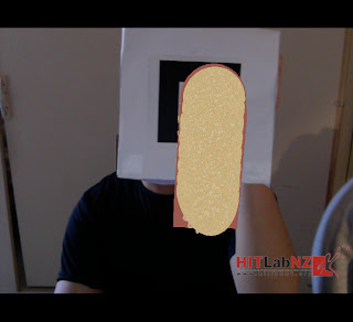
The final step was to place 6 different angles of the design on to the box. On the box, there are 6 markers and these designs related to my building design. I tried to use 6 most expressive faces displaying on the box.
订阅:
博文 (Atom)


